Blog Layout
Everything you need to know about designing a logo
Michael Baomont • Feb 27, 2023
Introduction
A logo is more than just a visual representation of a brand - it's often the first thing that customers notice and associate with a company. A well-designed logo can make a lasting impression, build brand recognition, and communicate the values and personality of a business.
However, designing an effective logo is not an easy task. It requires careful consideration of various design elements, from color and typography to shape and composition. That's why it's important to follow best practices when designing a logo, to ensure that it accurately represents your brand, appeals to your target audience, and stands the test of time.
In this blog post, we'll explore some of the most important logo design best practices that you should keep in mind when creating a logo. Whether you're designing a logo for a new startup or rebranding an existing business, these principles will help you create a logo that is memorable, versatile, and effective in communicating your brand identity.
So, let's dive in!
Research and Planning
Defining the brand identity
Defining the brand identity and message is a crucial first step when designing a logo. Your brand identity is the way that your brand presents itself to the world, including your core values, personality, and mission. Your logo should accurately reflect your brand identity and effectively communicate your brand message to your target audience.
To define your brand identity and message, start by asking yourself some key questions about your brand. What are your core values and beliefs? What is your brand personality - are you fun and playful, or serious and professional? What makes your brand unique and different from others in your industry? Answering these questions will help you develop a clear understanding of your brand identity and guide your logo design process.
Once you have a clear idea of your brand identity, you can start brainstorming ideas for your logo. Think about what symbols or icons might represent your brand values and personality, and how you can incorporate them into your logo design. For example, if your brand is focused on sustainability and environmentalism, you might consider incorporating a leaf or tree icon into your logo design.
Remember, your logo is often the first thing that customers will see when they interact with your brand. By taking the time to define your brand identity and message, you'll ensure that your logo accurately represents your brand and effectively communicates your message to your target audience.
Analyse the competition
Analyzing your competition is another important step in the logo design process. By researching your competitors' logos, you can gain insights into what works and what doesn't in your industry, and ensure that your logo stands out from the crowd.
Start by compiling a list of your main competitors and their logos. Look at each logo and ask yourself some key questions. What visual elements do they use? What colors do they use? What font styles do they use? What message do their logos convey?
As you analyze your competitors' logos, look for ways to differentiate your logo from theirs. Identify visual elements or color schemes that are overused in your industry, and consider avoiding them in your logo design. Look for opportunities to incorporate unique symbols or typography that will set your logo apart from others in your industry.
Remember, your logo should be unique and memorable, and should effectively communicate your brand message to your target audience. By analyzing your competition's logos, you can gain insights into what works and what doesn't in your industry, and create a logo that stands out from the crowd.
Sketch ideas and concepts
The Idea
Sketching ideas and concepts is an important part of the logo design process. Once you have defined your brand identity and analyzed your competition, it's time to start brainstorming ideas for your logo.
Start by sketching out a range of concepts and ideas. Don't worry about making them perfect at this stage - the goal is to generate a wide range of possibilities that you can refine later. You can use pencil and paper, or digital tools such as Adobe Illustrator or Sketch.
When sketching your ideas, consider different shapes, colors, and typography that could be used in your logo. Think about how you can visually communicate your brand message and personality through your logo design. Consider incorporating elements such as symbols, icons, or illustrations that represent your brand values and mission.
As you sketch your ideas, pay attention to what works and what doesn't. Consider asking for feedback from others, such as friends or colleagues, to get a fresh perspective on your ideas. Refine your concepts based on this feedback, and start to narrow down your options to a few strong contenders.
Remember, the logo you choose will be a crucial part of your brand identity, so it's important to take the time to explore a range of options and choose a design that accurately represents your brand and appeals to your target audience.
Best Practices
When sketching a logo, there are several best practices to keep in mind to ensure that you create a design that accurately represents your brand and effectively communicates your message to your target audience. Here are some tips:
- Keep it simple: A simple logo is easier to recognize and remember than a complex one. Aim for a design that is easy to read, with clear typography and minimal clutter.
- Consider scalability: Your logo will appear in a variety of sizes and contexts, so it's important to create a design that looks good at any scale. Avoid intricate details that might become difficult to see at smaller sizes.
- Use color strategically: Color can have a powerful impact on how people perceive your brand. Choose colors that complement your brand personality and values, and use them consistently across all of your branding materials.
- Make it timeless: A good logo design should stand the test of time. Avoid trendy elements that may quickly become dated, and focus on creating a design that will still look fresh and relevant years from now.
- Be original: Your logo should be unique and distinctive, so make sure to avoid using clipart or stock images in your design. Instead, focus on creating a logo that is original and memorable.
The 1-inch 'rule'
The 1-inch design rule is a best practice in logo design that suggests that a logo should be designed to be easily recognizable when reduced to a size of 1 inch (or 2.54 centimeters) in width.
The 1-inch design rule is important because logos are often used in small sizes on business cards, website icons, or social media avatars. If a logo is not designed to be recognizable at small sizes, it can become unreadable or lose its impact, which can make it difficult for customers to remember or recognize your brand.
To ensure that your logo is easily recognizable at a small size, it's important to keep the design simple and avoid intricate details that may not be visible at a small scale. Additionally, it's important to choose a font that is legible even when it is small.
By following the 1-inch design rule, you can create a logo that is effective and easily recognizable across a variety of applications and sizes.
Design Principles

When refining and iterating on your logo design, it's important to keep some basic design principles in mind. These principles can help you create a logo that is aesthetically pleasing, effective, and memorable. Here are some design principles to follow:
- Balance: A balanced logo has an even distribution of visual weight, creating a sense of harmony and stability. Achieving balance can be done through the use of symmetry, color, and shape.
- Proportion: Proportion refers to the size relationship between different elements in your logo. A well-proportioned logo is visually pleasing and creates a sense of order. It's important to ensure that each element of your logo is scaled appropriately and that the overall composition is harmonious.
- Contrast: Contrast can be created through the use of color, typography, and shape. Contrasting elements help to create visual interest and can help your logo stand out from competitors. However, it's important to use contrast sparingly to avoid overwhelming your design.
- Simplicity: A simple logo is easy to recognize, remember, and reproduce. A complex logo, on the other hand, can be confusing and difficult to reproduce. Keep your design simple and avoid unnecessary detail.
- Unity: Unity refers to the overall coherence and consistency of your design. All elements of your logo should work together to create a cohesive and harmonious design. Consistent use of color, typography, and shape can help to achieve unity.
- Repetition: Repetition creates consistency and reinforces your brand identity. Repeating certain design elements, such as shapes or colors, can help to create a strong and recognizable brand.
- Alignment: Alignment refers to the placement of elements in your logo design. Proper alignment creates a sense of order and professionalism, while misaligned elements can create a sense of chaos or confusion.
- Hierarchy: Hierarchy refers to the arrangement of elements in your logo design in order of importance. A well-designed hierarchy ensures that the most important elements of your logo are emphasized and stand out.
- Consistency: Consistency is key in logo design. All elements of your logo should be consistent across all applications, including color, typography, and shape. Consistency helps to create a strong and recognizable brand identity.
Typography

Font Choice
The font you choose for your logo should be legible and appropriate for your brand identity. Serif fonts, which have small lines or flourishes at the ends of letters, are often seen as more traditional and formal. Sans-serif fonts, which lack these lines, are often seen as more modern and informal. Choose a font that matches your brand's personality and values.
Font choice is a critical consideration when designing a logo. The font you choose can greatly impact the readability, mood, and overall feel of your logo. Here are some factors to consider when choosing a font for your logo:
Font choice is a critical consideration when designing a logo. The font you choose can greatly impact the readability, mood, and overall feel of your logo. Here are some factors to consider when choosing a font for your logo:
- Brand Identity: Your font choice should align with your brand identity. Consider the values, personality, and target audience of your brand. Are you a luxury brand that values tradition and sophistication? Or are you a modern and youthful brand that values innovation and playfulness? Choose a font that reflects your brand identity.
- Readability: Your font should be legible and easy to read, even at smaller sizes. Avoid overly decorative or complex fonts that can be difficult to read. Keep in mind that your logo may be used in a variety of contexts, from small icons to large billboards, so it's important to choose a font that remains legible at all sizes.
- Style: The style of your font should be appropriate for your brand identity. Serif fonts, which have small lines or flourishes at the ends of letters, are often seen as more traditional and formal. Sans-serif fonts, which lack these lines, are often seen as more modern and informal. Choose a font that matches the style of your brand.
- Originality: A unique and original font can help your logo stand out and be memorable. Consider creating a custom font or modifying an existing font to make it unique to your brand. However, it's important to balance originality with legibility and appropriateness for your brand identity.
- Compatibility: Consider the compatibility of your font with other design elements of your logo, such as colors, shapes, and other typography. Your font should complement these other elements and create a cohesive and professional design.
Font Size
Font size is an important consideration when designing a logo. Your font should be legible, easy to read and recognizable at all sizes, from small icons to large banners. Here are some factors to consider when choosing a font size for your logo:
Legibility: Your font should be legible at all sizes. Avoid using fonts that are too small or too large, as this can make your logo difficult to read. Test your logo at different sizes to ensure that the font remains legible and recognizable.
Context: Consider the context in which your logo will be used. Will it primarily be used on a website or social media profile, where it may appear small? Or will it be used on larger physical materials, such as billboards or posters? Be sure to choose a font size that remains legible and recognizable in each context.
Hierarchy: If your logo includes multiple lines of text, consider using different font sizes to create a hierarchy of information. This can help to emphasize important information and improve the readability of your logo.
Proportions: Consider the proportions of your logo as a whole. The font size should be proportional to other design elements, such as shapes or icons. Be sure to balance font size with other design elements to create a visually appealing and professional design.
By considering font size in your logo design, you can ensure that your logo remains legible and recognizable at all sizes and in all contexts. This can help to effectively communicate your brand identity and message while creating a visually appealing and professional design.
Kerning
Kerning is a typographic term that refers to the adjustment of space between individual letters in a word or phrase. Kerning is important in logo design because it can greatly impact the readability and overall aesthetic of the logo. Here are some considerations when using kerning in your logo design:
- Balance: Kerning should be used to create a balanced and visually appealing design. Adjusting the space between letters can help to create a more harmonious and even spacing, which can improve the overall aesthetic of your logo.
- Legibility: Kerning should not be used to the point where it affects the legibility of your logo. Letters that are too close together can become difficult to read and may detract from the message of your logo.
- Brand Identity: Consider the brand identity of your logo when using kerning. A logo for a luxury brand may use tighter kerning to create a more sophisticated and elegant look, while a logo for a playful brand may use looser kerning to create a more whimsical and fun look.
- Typeface: Different typefaces may require different levels of kerning. Some typefaces have more natural spacing between letters, while others may require more adjustment. It's important to experiment with different levels of kerning to find the best balance for your chosen typeface.
- Consistency: Consistent kerning should be used throughout your logo. Inconsistencies in spacing can create an unprofessional and disjointed look.
Line Spacing
Line spacing, also known as leading, refers to the amount of vertical space between lines of text in a logo. Line spacing is an important consideration in logo design because it can impact the legibility and overall aesthetic of the design. Here are some factors to consider when determining line spacing in your logo:
- Legibility: Line spacing should be used to improve the legibility of your logo. If the lines of text are too close together, the logo may be difficult to read. On the other hand, if the lines are too far apart, the logo may appear disjointed or unbalanced.
- Typeface: Different typefaces may require different levels of line spacing. Some typefaces have taller or shorter letters that may require more or less vertical space between lines. Experiment with different levels of line spacing to find the best balance for your chosen typeface.
- Brand Identity: Consider the brand identity of your logo when determining line spacing. A logo for a luxury brand may use tighter line spacing to create a more sophisticated and elegant look, while a logo for a playful brand may use looser line spacing to create a more whimsical and fun look.
- Hierarchy: If your logo includes multiple lines of text, consider using different levels of line spacing to create a hierarchy of information. This can help to emphasize important information and improve the readability of your logo.
- Proportions: Consider the proportions of your logo as a whole. The line spacing should be proportional to other design elements, such as shapes or icons. Be sure to balance line spacing with other design elements to create a visually appealing and professional design.
Contrast
Contrast is a powerful tool in logo design that can help create visual interest and make your brand stand out. Color is one of the most common ways to create contrast in logo design. By using contrasting colors, you can make certain elements of your logo pop and draw attention to your brand. For example, a dark blue logo on a light yellow background creates a high level of color contrast that is eye-catching and memorable.
In addition to color contrast, designers can also use contrast in the shape and size of their logo elements. Contrasting shapes, such as a circle and a square, can create a dynamic and interesting logo. Similarly, varying the size of elements within your logo can help create hierarchy and emphasis. For example, a larger company name or slogan can be used to create contrast with smaller icons or graphic elements.
Contrast is also important in typography. By varying the weight, size, and style of different typefaces within your logo, you can create a unique and interesting design. Bold and italicized fonts can create contrast with regular fonts, while varying the size of type can help to create a hierarchy of information.
When considering contrast in logo design, it's important to remember that balance is key. Too much contrast can create a chaotic and overwhelming design, while too little contrast can create a bland and forgettable logo. Experiment with different levels of contrast to find the right balance for your brand.
In summary, contrast is a powerful tool in logo design that can help make your brand stand out and create a memorable design. By using contrasting colors, shapes, sizes, and typography, designers can create a visually interesting logo that effectively communicates their brand identity and message.
Color Considerations

Color is an important consideration in logo design as it can convey a brand's personality and evoke emotional responses from viewers. Here are some factors to consider when choosing colors for your logo:
- The Psychology of Color: Different colors can evoke different emotional responses from viewers. For example, red can convey energy and excitement, while blue can convey trust and professionalism. Understanding the psychology of color can help you choose colors that align with your brand's personality and message.
- Choosing a Color Palette that Fits the Brand: When choosing a color palette for your logo, it's important to consider your brand's identity and target audience. For example, a children's toy brand may use bright and playful colors, while a luxury fashion brand may use more muted and sophisticated colors.
- Using Color Effectively in the Logo Design: Once you have chosen a color palette for your logo, it's important to use the colors effectively in the design. Consider how colors interact with each other and how they will appear on different backgrounds and in different contexts. Using too many colors or colors that clash can create a confusing and overwhelming design.
- Color Contrast: As discussed earlier, contrast is an important consideration in logo design. Choosing colors that contrast with each other can help create visual interest and make your logo stand out. For example, using a light-colored logo on a dark background can create a high level of color contrast that is eye-catching and memorable.
- Accessibility: When choosing colors for your logo, it's important to consider accessibility for colorblind individuals and those with visual impairments. Using color combinations that are easily distinguishable can help ensure that your logo is accessible to all viewers.
Finalizing the design

Finalizing the design of a logo is a crucial step in the logo design process. It involves refining the design and ensuring that it meets the needs of the brand and effectively communicates the intended message. Here are some best practices for finalizing the design of a logo:
- Refine the Design: Once you have a rough sketch or a few design concepts, refine the design by selecting the strongest elements from each and combining them. Refining the design involves editing and adjusting the elements to ensure that they work well together and convey the intended message.
- Get Feedback: It's important to get feedback on your logo design from others, such as colleagues, clients, or focus groups. Feedback can help you identify potential issues with the design and make necessary adjustments.
- Consider Scalability: It's important to consider how your logo will appear at different sizes and in different contexts. Make sure that the design is scalable and easily recognizable when displayed at small sizes or in black and white.
- Test the Design: Before finalizing the design, test it in different contexts to ensure that it works well in all situations. This includes testing the logo on different backgrounds and materials, such as business cards or promotional items.
- Choose File Formats: Once the design is finalized, choose file formats that are appropriate for the intended use of the logo. For example, a vector file may be necessary for large-scale printing, while a high-resolution PNG may be suitable for web use.
Examples of successful logo designs

Google logo is playful and colorful, representing the brand's commitment to innovation, creativity, and user-friendliness.
Amazon
The Amazon logo features a simple arrow that points from the letter "A" to the letter "Z", representing the brand's vast selection of products.


Coca-Cola
The Coca-Cola logo, which features a flowing script font and a red and white color scheme, is classic and timeless. It represents the brand's commitment to quality and enjoyment.
FedEx
The FedEx logo features a hidden arrow within the negative space between the "E" and the "x". This subtle design element adds an extra layer of meaning to the logo and has become a beloved symbol of the brand's efficiency and reliability.
Conclusion
In conclusion, designing a logo that effectively represents a brand's identity and message requires careful consideration of several key factors. From defining the brand identity and analyzing the competition to sketching ideas and finalizing the design, there are many best practices that designers should follow to create a successful logo.
In addition to these best practices, designers must also consider typography, contrast, color, and other design principles when creating a logo. By carefully selecting fonts, adjusting kerning and line spacing, and using color effectively, designers can create a logo that effectively communicates the brand's identity and resonates with its target audience.
Finally, successful logos are simple, memorable, and versatile. They create a strong visual identity that instantly communicates the brand's values and message. Whether it's Nike's "swoosh," Apple's bitten apple, or Coca-Cola's classic script font, iconic logos have become a part of our culture and a symbol of the brands they represent.
In the end, the key to creating a successful logo is to carefully consider every aspect of the design and ensure that it effectively represents the brand's identity and values. By following best practices and taking a thoughtful approach to design, designers can create logos that not only look great but also help brands stand out and establish a strong visual identity.
Join our newsletter
Get news and updates as they happen!
Tridah | Newsletter

With the digital age evolving rapidly, online accessibility has become a paramount concern for businesses, especially in light of a significant surge in digital accessibility lawsuits. The legal pressure for websites to become more accessible has never been greater. This post will delve into the realm of the Americans with Disabilities Act (ADA) and its role in the digital landscape, its implications for businesses, and how companies can meet these vital requirements.

Tridah Non-Profit is dedicated to providing affordable web design, branding, SEO, and blog writing services to non-profits and causes with smaller budgets. Founded by Michael, Tridah was born from his passion for helping non-profits overcome the challenges of building a strong online presence. In this blog post, we will explore Tridah's mission, services, and success stories, and discover how Tridah can empower your organization or project.
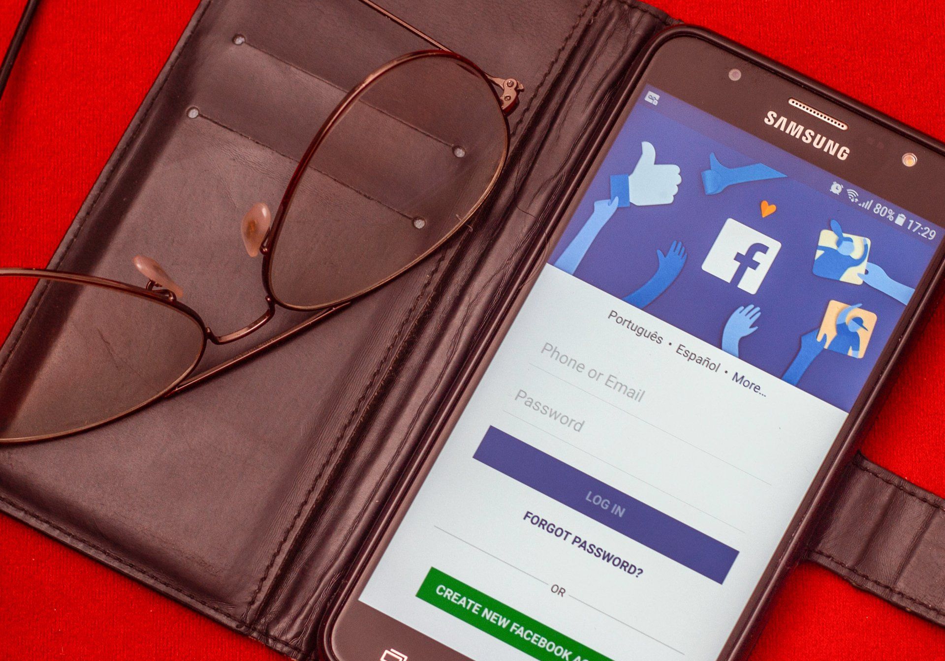
As a small to medium-sized business owner, you're constantly looking for ways to grow your business and reach new customers. While social media platforms like Facebook have become popular tools for businesses, relying solely on a Facebook group for your online presence may not be the most effective strategy. In this article, we'll explain why a Facebook group isn't enough for your business and how having a website can unlock your full potential, reaching a wider audience and making your brand more accessible to potential customers.

In today's digital era, a strong online presence is critical for businesses to thrive. Choosing the right website builder is a crucial decision that can significantly impact your business's success. While WordPress has been the go-to option for many years, Tridah offers a superior alternative, particularly for small to medium size businesses. In this article, we'll compare Tridah and WordPress, highlighting the reasons why Tridah is the better choice for your business.

Starting a new business is an exhilarating journey filled with countless decisions. One of the first and most important decisions you'll make is choosing a name for your venture. While the name is crucial, it's essential to remember that branding plays a more significant role in defining your business identity. This blog post will discuss the importance of branding and how it transcends the name in giving meaning to your business.
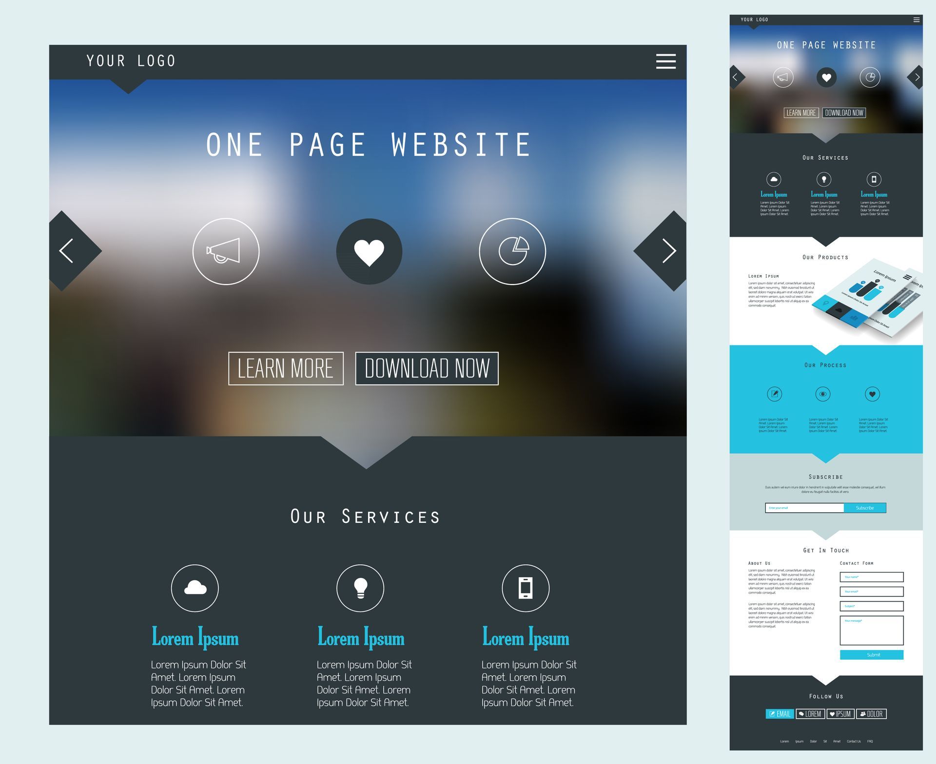
In today's digital age, landing pages have become an essential tool in online marketing. Landing pages are specially designed web pages that are created to serve a specific purpose, such as generating leads or encouraging users to make a purchase. They are often used in conjunction with online advertising campaigns and email marketing to drive traffic to a particular product or service. Landing pages have become an integral part of any online marketing strategy, and understanding how to create and optimize them can make a significant impact on your conversion rates. In this blog post, we will explore the key elements of landing pages, best practices for creating effective landing pages, and tips for optimizing landing pages for better performance. Whether you are new to online marketing or looking to improve your existing landing pages, this post will provide you with the tools and knowledge to succeed.

Web design refers to the process of creating and designing the visual aesthetics and layout of websites. It involves the use of various design elements such as color, typography, imagery, and layout to create an appealing and user-friendly website. The goal of web design is to create a visually engaging and functional website that effectively communicates the intended message, provides a positive user experience, and achieves the desired objectives of the website owner or stakeholders.

Branding is the process of creating and shaping a company's image in the minds of consumers. It is a way for businesses to differentiate themselves from their competitors and establish a unique identity in the marketplace. At its core, branding is about creating a perception of value for a company's products or services. This value is communicated through a variety of channels, such as a company's name, logo, slogan, packaging, and advertising. A strong brand can help a company build trust and loyalty among its customers. It can also make it easier for a company to introduce new products or expand into new markets. Additionally, a strong brand can also help a company command a higher price for its products or services, as customers are willing to pay more for a product or service they perceive to be of higher value. In order to create a strong brand, companies must first understand their target audience and what they value in a product or service. They must also identify their unique selling proposition, which is the aspect of their product or service that sets it apart from the competition. Once a company has a clear understanding of its target audience and unique selling proposition, it can begin to develop its brand identity. This includes creating a brand name, logo, and slogan that accurately reflects the company's values and message. The brand identity should also be consistent across all marketing materials, such as packaging, advertising, and social media. Effective branding requires consistent effort over time. It's important for companies to regularly review and update their branding to ensure it stays relevant and continues to resonate with its target audience.